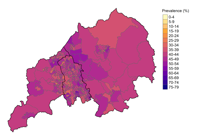
Physical inactivity
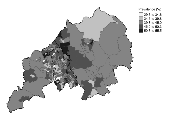
There are two maps for each of the following sections – pain in different parts of the body, factors that impact on MSK problems, other health conditions, physical activity and informal care. The colour maps present the amount of each health issue in each area. The second map, in grey, presents the amount in comparison to the other areas and in this we can highlight which areas have lower and higher levels.
Colour
- The map shows the proportion of people aged 35 and over in each area who are physically inactive. These are people who have a sedentary job and do less than one hour of exercise per week, people who have a standing job and do no physical exercise and people not in employment, including retirement, who do not do physical exercise or cycle. The proportion for areas varies from 29.3% to 55.5%. On the map the lighter orange and pink areas are where around 1 in 3 people are physically inactive. In the purple areas more than half of people are physically inactive.
Grey
-
This extra version of the map is tailored to show the difference in physical inactivity between neighbourhoods more clearly. Physical inactivity most common in the areas shaded in the darkest grey. Physical inactivity is least common in the areas shaded in the lightest grey.