Keele's colours and badges
Keele was founded in 1949 as the University College of North Staffordshire and the coat of arms was adapted from that of the Sneyd family, owners of Keele Hall and the Keele estate since 1540. The Royal Charter was granted to the "University of Keele" in 1962 and this is the formal and official name of the University. The term "Keele University" was adopted as the preferred term for day-to-day use in about 1989.
The scythe is the Sneyd family armorial device but the Sneyd shield featured a black scythe on a white field. The black-and-white colour scheme of the Sneyd family was not retained when the new College adopted red and gold at the behest of the founder, Lord "Sandie" Lindsay. Two speculative explanations have been offered for the choice of red and gold. One is that they are the colours of Marylebone Cricket Club at Lord's - the home of cricket - and a second is that they are the colours of the Labour Party. Both are plausible as Lindsay was a renowned Christian socialist.
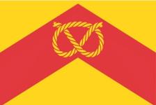 The true explanation is that they were taken from the Staffordshire county colours of a red chevron on a yellow or gold background. The flag of the county of Staffordshire (right) was registered with the Flag Institute on 28 March 2016 following a competition between two rival designs. The winning design was proposed by the Staffordshire Heritage Group design. The flag incorporates the Stafford knot in gold on the de Stafford coat of arms. The symbol of the Stafford Knot is unique to the county with a venerable tradition and widespread usage. The colour scheme of gold on red is displayed in many of the arms found throughout the county.
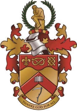
The three devices in the field at the top (chief) of the shield represent the three local government authorities that contributed to the foundation of the new University College: the fleur-de-lys for Burton-on-Trent, the Stafford Knot for Stafford, and the Fret (typically a symbol of industry representing the weave and weft of textiles) for Stoke-on-Trent.
The formal grant of arms of the University's heraldic design reads thus:
Or on a Chevron Gules an open Book Argent in base a Scythe proper on a Chief wavy of the second a Stafford Knot between a Fleur de Lys and a Fret of the first. And for the Crest on a Wreath of the Colours In Front of a Wreath of Laurel Vert a representation of Rodin's statue "Le Penseur"
The motto "Thanke God for All" belonged to the Sneyd family and is visible in the stonework at many locations around Keele Hall - most prominently above the fireplace in the Great Hall and above the courtyard door into the cellars. This motto was adopted by the University College and is heard every year at Graduation ceremonies in the University invocation: "May grace be given us to thank God for all". The latter was derived from a Grace written by R B Henderson ("Henders"), the first lecturer in Historical Theology.
It is rumoured that Keele students of every generation have been tempted to modify the motto "Thanke God for All" to read "Thanke God for Ale"..
The version of the coat of arms depicted below with the motto “Thanke God for Ale” was drawn by Keele lecturer, Dr Ian Stimpson:
"If you look closely at the images at the top (above) and to the right you will see that the 'Fret' is rotated by 45 degrees relative to the other versions of the coats of arms. This convinces me that I drew that original image over 20 years ago, in 1993. I was a junior lecturer in the Geology department and we were trying to produce some certificates for awards at the graduation drinks reception, but in those days digital versions of the image were not available. In a hurry, I took a carrier bag from the campus supermarket which in those days was emblazoned with the crest and did a quick imitation, drawn by hand with a computer mouse using Windows Paint as a bitmap image. In my haste I messed up on the Fret. That version, being the only digital version available, got copied around the university and obviously is still used in places. I also did a version for the Geology department that removed the symbols and put a drilling rig where the Staffordshire Knot is located with a borehole descending through the apex of the chevron and the strapline modified to 'Thanke God For Oil'". This one on the right is an even earlier version with the more common students’ variant of the motto."
Ian Stimpson
 The red chevron and gold field of Staffordshire were adopted and used by the University College of North Staffordshire and Keele University for formal documents from the very beginning. Gold and Red remain the official colours of the University.
From the 1970s onwards, a series of corporate logos, brand images and colours were adopted, all with the intention of bringing a modern and refreshing feel to the official visual identity. These have included various arrangements of blue, green and other colours with a range of logos and fonts - but all of these were fairly short-lived and none was particularly popular.
At all times the shield had remained in use for formal use although corporate letterheads and prospectuses and other documents have used a variety of logos and images over the years. One of the most popular themes used in prospectuses during the 2000s was the term "Love: Keele", which prompted the adoption of "Forever: Keele" in 2005 as the "brand" for alumni relations.
The full-colour shield (right) with the full grant of arms - wreath, Le Penseur, motto - has been used as the official crest appearing on official documents, including graduation certificates.
![]() The longest-lasting corporate design (left) was adopted in 1995 and it was used until 2011, longer than any other "corporate logo or image", not employing the shield.
The longest-lasting corporate design (left) was adopted in 1995 and it was used until 2011, longer than any other "corporate logo or image", not employing the shield.
 This design featured green, black and white with an intertwined ribbon motif. The ribbon is not, as commonly believed, a representation of the DNA helix but symbolises the Keele ideal of educational disciplines overlapping and combining to create a greater whole. Green was adopted as the key colour in this image to reflect the green campus. Green was a new departure in the colour scheme but it was retained when the next image was introduced in 2011. This "helix" design was used widely but the original shield remained in the most formal situations. The expansion in student numbers since 1995 meant that by 2011 around two-thirds of Keele’s alumni had attended Keele "under the helix". Those with an artistic eye from yesteryear will have spotted a beautiful glass mosaic ceiling in the Keele Ballroom – formerly the Horwood Refectory or the Keele Hall Restaurant – which depicts entwining ribbons of intellectual endeavour. In 2009 this was concealed above a suspended ceiling during a refurbishment of the Ballroom.
![]() In 2011, the new Keele University visual identity (left) returned to the familiar motifs of the shield and coat of arms, but it was presented in a modern idiom suitable for digital and online display.
In 2011, the new Keele University visual identity (left) returned to the familiar motifs of the shield and coat of arms, but it was presented in a modern idiom suitable for digital and online display.
The new image helps prospective students, students, staff, alumni, employers and others to identify Keele immediately as an established University with a proud and distinctive tradition of providing education of the highest quality. One question recurs frequently: "Why does the Keele shield have a 7 in it?" The 7 is actually a scythe but in smaller images, it can be hard to identify.
The new 'logo' draws heavily on the University's armorial bearings and reintroduces the rich golds and reds of the original arms and crest and of Staffordshire. The colour green arrives as part of a weave pattern on the shield. The use of green is chosen to reflect the campus and a commitment to sustainability. The weave produced by the ribbons of gold, red and green also represents the distinctive interdisciplinary curriculum.
The five original heraldic devices "in the first" are also clearly visible in a more contemporary form.
Students' Union colours
 The embryonic Students’ Union took seriously the task of creating its own identity and traditions and quickly introduced its own colours. The Union chose to add black to the red and gold and the Athletic Union (KUAU) and Keele’s sports teams followed suit, using these colours for sports kits, uniforms and badges.
Red, black and gold are still used by the Student’s Union and they survive to this day in all Students' Union and Athletic Union merchandise and memorabilia of all kinds. The Students’ Union has produced items in every variation of colours over the years but the most formal items have always used combinations of red, black and gold.
Red, gold and black continue to be the key colours for sports teams and uniforms of the Athletic Union - Keele sports clubs adopted a common name of TEAM: KEELE for Varsity 2009 and have retained it subsequently.
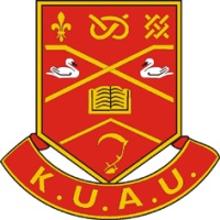
The AU crest (left) is unusual for having added a swan motif to the usual; scythe, book and heraldic devices. This shield also has a unique presentation of the chevron.
Photo below: John Easom (1981) explains the colours of the SU tie, also used by the AU, to Imi Agboaye (2017) on Imi's Graduation Day, 2017.
"I can proudly look back and say I did the most. I got involved in everything I could have, I made the best friends, I walked to the end of the woods, I felt safe walking home in the dead of night and I learned to walk with God. One thing I'm proud of is the fact that I was able to learn a lot about the Uni itself and share that passion with others. I served as a Heritage Guide in my first year and never forgot the important information that allowed me to value my time at Keele through appreciating its traditions and rich history."
Imi Agboaye (2017)
Dave Garry (1973) has identified that the AU tie (diagonal stripes of red, black and gold) resembles that of Richmond Rugby Football Club,
"The website of Lord’s, the Home of Cricket, states that their red and gold (affectionately referred to as 'egg and bacon') appeared for the first time in the 1860s. It has been suggested that the MCC borrowed its colours from I Zingari, the first and grandest of the wandering clubs founded in the 1860s and whose colours were black, red and gold."
Did Keele take its colours from the MCC?
A faded hand drawing of the University College arms by one of the earliest students...
![]()
"Certainly in the first and second tranches of undergraduates, it became very fashionable and widespread to buy a blazer badge (I still have a near rusty one) and sew (usually with feminine assistance) this to one end of the scarf."
Bill Lighton (1954)
"The Cum Grano edition which was published around September 1955 contains an interesting Supplement "intended primarily as an introduction to the organisation and workings of the Students' Union". This lists all of the Union Societies existing at the time and the names of their officers. It shows that there was just one telephone in the Union at the time (Keele Park 232) and that one could buy one of two designs of scarf for 24 Shillings and Sixpence from the College Outfitters in Newcastle, namely Henry White's Ltd. Ties could be bought for between 9 and 15 shillings."
John Groom (1955)
"Years ago every student wore a scarf representing his/her University or College: not so now it seems. At Keele we had the choice of 'egg and tomato' or 'black, egg and tomato' scarves. The red and yellow/egg and tomato scarf was the 'official' scarf whilst the black, red and yellow was the Union scarf. My very old 'black, egg and tomato' scarf is tucked away at the back of a drawer in company with my wife's old Chiswick Poly scarf, but I don't wear it any more of course. I am never sure how a choice was made between the two scarves - perhaps if you considered yourself 'establishment' you purchased the official scarf? If a bit of a rebel perhaps you opted for the Union version? Or did the choice go with the subjects to be studied? Had we thought that fifty years on it might be a matter for discussion a survey could have been undertaken at the time together with graphs, pie charts, bar charts etc? There was, I am sure, a debate in the Union on the motion 'that this House prefers black, egg and tomato to egg and tomato' - no reference to the underlying matter of which scarf we put around our necks. The value of wearing a scarf was to identify your alma mater especially when out and about outside the Potteries. I can re-call meeting 'unknown' Keele undergraduates in London identifying them only by virtue of the scarf around their neck."
John Pearson (1958)
It was fashionable in the 1950s, when the University was founded, for students everywhere to display their allegiance with scarves and badges in their colours. The original University scarf had red and gold stripes and was promptly nicknamed the “tomato and egg”. The Students Union soon issued its own variation featuring black, red and gold stripes and this endures to this day. The black stripes soon acquired the term “black pudding” to go with the tomato and egg. Whether to wear the tomato and egg or to sport the added black pudding posed a quandary for some….
"The scarf, I can vaguely remember, was entirely gold with a crimson stripe. The original pioneers had them. When I got to Keele in '57 some of the older students had them, if I remember correctly. So they were still worn by those who graduated in 1957 or 1958. I imagine that they were available for purchase up until say 1955. I vaguely remember buying my scarf (second design) in a shop in Newcastle. And in those days you could not enter the library (access through the steps-up entrance to Keele Hall in the courtyard, then turn left; it was where the formal dining room is now) without a gown so I purchased a gown with it.”
John Idris Jones (1961)
Photo above: Jill Porter (1955) sports her original tomato-and-egg scarf at the 2013 Golden Graduates reunion
"I bought a red and yellow scarf (which I still have now in 2010) as a fresher in 1958, and was later asked by other students why I was wearing a “blood and guts” scarf. I only ever heard it referred to as that while I was at Keele. I never heard of the “tomato and egg” until I read this article."
Margaret Steele (Owen) (1962)
"I seem to remember the red and gold scarf being referred to as the blood and custard scarf. There was also a black red and yellow one which I had and lost at the Tron theatre in Glasgow where my teenage band was playing for Michael Boyd's production of Faustus ('88). I mention this because two years previously they had been playing in Manchester for a School's Prom and we stayed a few days at Keele and rehearsed in the basement of the Walter Moberly Hall, the same room where I first heard the Talking Potteries Blues and The Chastity Belt twenty-five years earlier. It takes ages to leave Keele! I have given up trying now."
Richard Tedstone (1966)
"The Keele scarf was almost identical to the one worn by Dockyard apprentices in Plymouth, my home town (and there were not too many female apprentices!)"
Margaret Peat (1969)
"I have a red and gold scarf, which I bought in the Union shop in 1965. It was no longer the official scarf, which was gold, black and red, but it seemed to have an "alternative" cachet and was popular with those who wanted to be a bit different! I also found out at some stage that it was the Labour Party colours and I was told that Lindsay had selected it."
Helen Elias (Fleming) (1969)
"I enjoy learning about the change of logos and the scarf colours. I was very proud of my scarf, it was one of the first things I bought on arrival at Keele. Sadly, my girlfriend at the time borrowed it and pushed it through a washing machine thereby shrinking and ruining it. I think she may have kept it afterwards and I never bothered to replace it."
Peter Meade (1979)
Photo below: Red and gold (left) and red, black and gold (right) worn at the first RAG Procession 1956
"The red and gold was the original "official" University scarf from the beginning. I believe the black, red and gold were brought in later in the 1950s as the Union scarf. The red and gold only seem to have died out as it was associated with the "Establishment" during the turbulent Sixties. It seems that the red and gold scarf was never produced again but whether it remained nominally the official scarf is uncertain. It certainly became unobtainable and surviving examples are a rarity! The red, black and gold reigned supreme and unchallenged until the 1990s when a green and black and white version arrived as the new "official" University scarf to match the new logo and identity, but it was rarely seen or worn. The black, red and gold has persisted as the Union scarf and is the only one readily available in the Union Shop. This version enjoys the affections of students and alumni alike."
John Easom (1981)
The Union Concourse or Union Square – once known as the Forum - was refurbished in 2012. The tree planting includes mature maples and oaks selected to bring impressively rich shades of green, red and gold to the living campus and to reflect the traditional Keele colours. Red and gold maples were given by Phil Davies (1971) in memory of his late wife Ros Davies (1971) - they met at Keele. The North American maples reflect Phil's pursuit of American Studies and the Russian maples, Ros's Russian Studies at Keele.