Other health conditions
There are two maps for each of the following sections – pain in different parts of the body, factors that impact on MSK problems, other health conditions, physical activity and informal care. The colour maps present the amount of each health issue in each area. The second map, in grey, presents the amount in comparison to the other areas and in this we can highlight which areas have lower and higher levels.
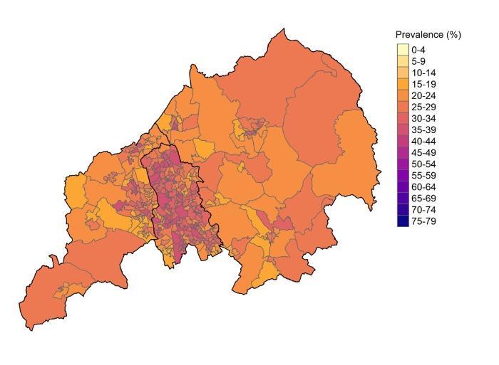
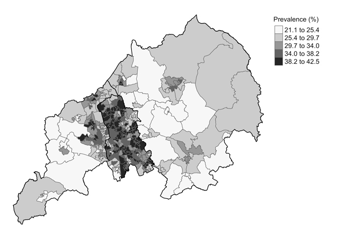
Anxiety (any anxiety symptoms) (colour)
- This map shows the proportion of people in each area who experience any symptoms of anxiety for any amount of time during a 1 week period. This ranges from 21.1% to 42.5%. On the map the lighter orange areas are where there are between 1 in 5 and 1 in 4 people experience any anxiety symptoms at any point in the previous week. In the pink areas over 1 in 3 people experience any anxiety symptoms.
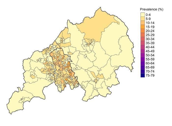
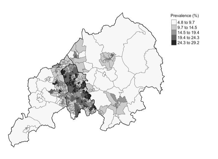
Anxiety (moderate to severe anxiety) (colour)
- This map shows the proportion of people who experience moderate to severe anxiety during a one week period; these are symptoms severe enough to be called clinically significant anxiety. The range is 4.8% to 29.2%. On the map the lighter yellow and orange areas are where there are between 1 in 20 and 1 in 10 people with moderate to severe anxiety. In the darkest orange areas around 1 in 4 people experience moderate to severe anxiety.
Depression (any depression symptoms) (colour)
- This map shows the proportion of people in each area who experience any symptoms of depression for any amount of time during a 1 week period. This ranges from 5.1% to 30.0%. On the map the lighter (yellow) areas are where there are between 1 in 20 and 1 and 10 people experience any depression symptoms at any point in the previous 6 months. In the darkest orange areas between 1 in 3 and 1 in 4 people experience any depression symptoms.
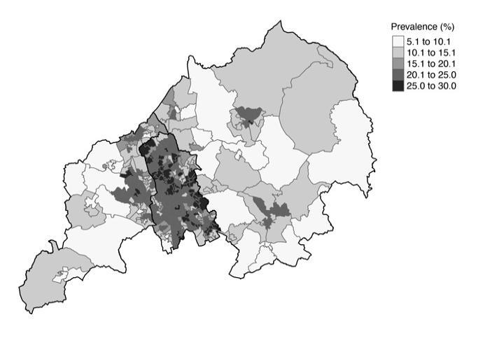
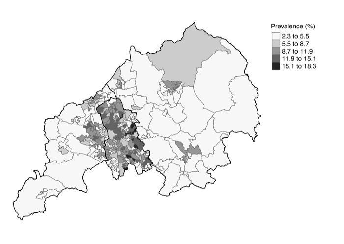
Moderate to severe depression (colour)
- This map shows the proportion of people who experience moderate to severe depression during a one week period; these are symptoms severe enough to be called clinically significant depression. The range is 2.3% to 18.3%. On the map the lighter yellow areas are where there are between 1 in 40 and 1 in 25 people with moderate to severe depression. In the orange areas around 1 in 6 people experience moderate to severe depression.
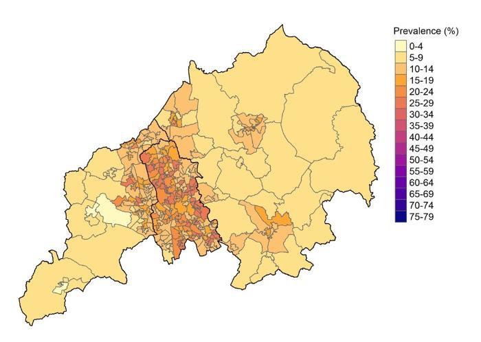
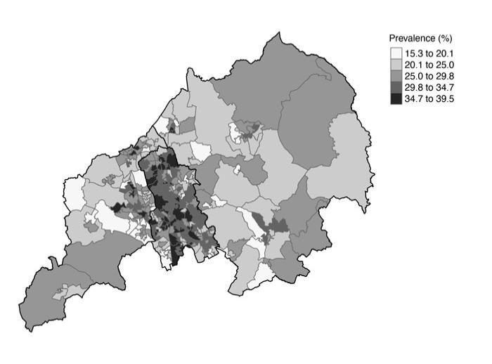
Obesity (colour)
- The map shows the proportion of people aged 35 and over in each area who are obese. The proportion for areas varies from 15.3% to 39.5%. On the map the lighter orange areas are where between 1 in 6 and 1 in 5 people are obese. In the pink areas between 1 in 3 and 1 in 2 people are obese.
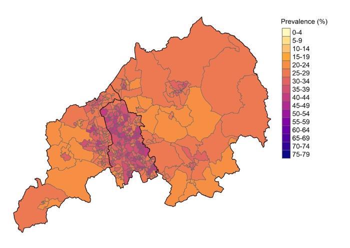
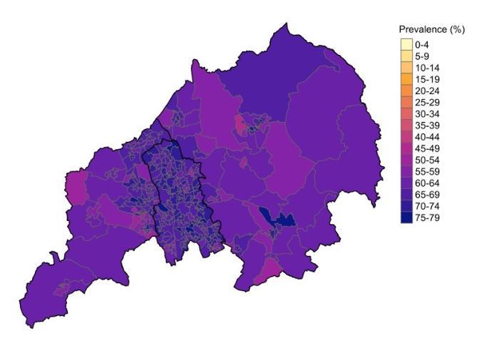
Overweight and obese (colour)
- The map shows the proportion of people aged 35 and over in each area who are overweight or obese. The proportion for areas varies from 49.8% to 76.2%. On the map the pink areas are where around 1 in 2 people are overweight or obese. In the darkest purple and blue areas around 3 in 4 people are overweight or obese.
Anxiety (any anxiety symptoms) (grey)
-
This extra version of the map is tailored to show the difference in anxiety between neighbourhoods more clearly. Anxiety is most common in the areas shaded in the darkest grey. Anxiety is least common in the areas shaded in the lightest grey.
Anxiety (moderate to severe anxiety) (grey)
-
This extra version of the map is tailored to show the difference in moderate to severe anxiety between neighbourhoods more clearly. Moderate to severe anxiety is most common in the areas shaded in the darkest grey. Moderate to severe anxiety is least common in the areas shaded in the lightest grey.
Depression (any depression symptoms) (grey)
-
This extra version of the map is tailored to show the difference in depression between neighbourhoods more clearly. Depression is most common in the areas shaded in the darkest grey. Depression is least common in the areas shaded in the lightest grey.
Moderate to severe depression (grey)
- This extra version of the map is tailored to show the difference in moderate to severe depression between neighbourhoods more clearly. Moderate to severe depression is most common in the areas shaded in the darkest grey. Moderate to severe depression is least common in the areas shaded in the lightest grey.
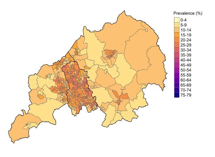
Obesity (grey)
- This extra version of the map is tailored to show the difference in obesity between neighbourhoods more clearly. Obesity is most common in the areas shaded in the darkest grey. Obesity is least common in the areas shaded in the lightest grey.
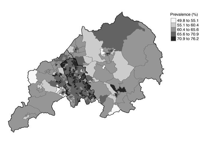
Overweight and obese (grey)
- This extra version of the map is tailored to show the difference in overweight and obesity between neighbourhoods more clearly. Overweight and obesity is most common in the areas shaded in the darkest grey. Overweight and obesity is least common in the areas shaded in the lightest grey.